Charter Schools in Hudson County, NJ: Skimming the Cream?
Hudson County Charter Schools:
A Case Study
The role of charter schools within New Jersey’s education system continues to be a hotly debated topic, particularly in the state’s urban areas. News reports have detailed an ongoing controversy over the expansion of a charter school in Hoboken.[i] In Jersey City, charter school policies have been an important part of the city’s political races.[ii] These communities, both in Hudson County, provide an excellent case study for examining how student achievement, economic disadvantage, and charter enrollment interact.
A central issue in the Hudson County charter school debate is the role of cream-skimming: the practice of serving a disproportionate number of children who are not economically disadvantaged or who do not have special educational needs compared to a charter’s sending area.[iii]
The correlation between poverty and academic performance[iv] is well known, as is the influence of “peer effect”[v] on student achievement. If charter schools are serving students who largely come from higher socio-economic status groups, they will have an advantage over their neighboring traditional public schools (TPSs); further, that advantage may come at a cost to those TPSs, who must educate the economically disadvantaged students that the charter schools do not serve.
To determine if Hudson County’s charter schools enjoy a cream-skimming advantage, we first need to compare their student populations to the schools that serve students in the same community.
Calculating a “Disparity Ratio”
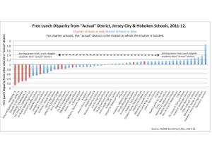
Drawing on 2012 data from the New Jersey Department of Education (NJDOE)[vi], the graph below shows a free lunch (FL) eligible “disparity ratio” for every public school – both charters and TPSs – in Hudson County. The ratio is calculated through this equation:
Disparity ratio = school’s percentage of free lunch eligible students / “actual” district’s percentage of free lunch students
Students who are eligible for FL are economically disadvantaged[vii]: their families have incomes at or below 130% of the federal poverty line[viii]. The “actual” district of a charter school is the school district where the charter is physically located (charter schools are, by law, considered to be their own districts[ix]); for a TPS, it is the district of the school. To calculate an “actual” district’s population, add the population of all charters located within the boundaries of that school district to the populations of all TPSs in the district; the “actual” district’s FL population is calculated the same way.
The disparity ratio then compares each school’s FL percentage with the “actual” district’s FL percentage. For example, Hoboken’s “actual” FL percentage is 48%.[x] If a school in Hoboken has a disparity ratio of “1,” its free lunch percentage would be 48%. If the school had a free lunch percentage of 96%, it’s disparity ratio would be “2”; a school with 24% FL eligible students would have a ratio of “0.5.”
The eleven charter schools for which NJDOE had data in 2012 are shown in red.
The majority of Hudson County’s charter schools serve a significantly smaller percentage of students who are economically disadvantaged than their neighboring TPSs.
Economic Disadvantage and Student Academic Performance
How does student performance correlate to the free lunch disparity of a school?
This graph shows FL disparity plotted against aggregate grade-weighted proficiency[xi], a measure of the percentage of all test takers at a school who reached the level of “proficient” or higher on New Jersey’s state-wide standardized test, the NJASK. While the measure likely hides important differences in test scores[xii], it is still a viable and concise way to judge differences between schools.
While Hudson County’s charter schools do have relatively high rates of proficiency, it is worth noting that many of the county’s TPSs perform at the same level, even though they have less disparity in the percentage of economically disadvantaged children they enroll. In addition, the trend-lines for both types of schools show that, on average, a TPS will show a higher rate of aggregate proficiency when compared to a charter school with the same FL disparity. Of course, this is merely conjecture when it comes to the highest-performing charters, as there are no TPSs in Hudson County that have comparable levels of FL disparity.
The “r-sq” number represents how much of the difference in proficiency can be statistically “explained” by a difference in FL disparity. Here, over 70% of the variation in proficiency among the Hudson County charters can be explained by their FL disparity, a strong correlation.
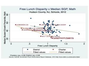
Another way to measure student achievement is through “growth” on test scores[xiii]:
The Median Student Growth Percentile (mSGP) is calculated by NJDOE to show how much growth a student exhibited in test scores over the previous year, as compared to students starting with the same score[xiv]. As with proficiency rates, many TPSs in Hudson County show just as much growth – if not more – as measured by mSGP as charter schools; however, those schools often have far less disparity in the percentage of FL students they serve than Hudson’s charters.
Of course, a legitimate reply to this analysis would be to point out that schools in low-poverty districts may not have high levels of disparity with their “actual” district; they may still, however, serve lower percentages of FL students than Hudson’s charter schools.
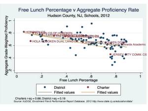
The graph below compares aggregate grade-weighted proficiency against the percentage of students in each Hudson County school who qualify for Free Lunch:
Even compared to low-poverty district schools, Hudson‘s charters serve a small percentage of FL students. And many TPSs serving far greater percentages of FL students get comparable or better results.
Conclusions: Are Hudson County’s Charters Skimming the Cream?
Certainly, there is no evidence within the NJDOE data to show that charters in Hoboken and Jersey City are engaging in a deliberate pattern of cream-skimming. That same data, however, is quite clear: the charter schools in Hudson County that have higher rates of proficiency and/or student growth do not serve the same percentage of economically disadvantaged students as their neighboring traditional public schools.
Further, there is a clear correlation between these charter schools’ test outcomes and the relative percentage of free lunch students they serve compared to their neighboring TPSs. The correlation is much stronger for the county’s charter schools than its TPSs.
Hudson County’s policy makers, education leaders, and citizens need to ask themselves a question:
Are cream-skimming charters a good investment if their test score outcomes correlate closely with their disparity in serving economically disadvantaged children?
Endnotes
[i] “Request to block Hoboken charter school’s expansion, renewal put on pause.” The Star-Ledger, 11/13/13. http://www.nj.com/hudson/index.ssf/2013/11/request_to_block_hoboken_charter_schools_expansion_renewal_put_on_pause.html
[ii] “Supporters boast after Fulop wins Jersey City mayor’s race.” The Star-Ledger, 5/15/13. http://www.nj.com/hudson/index.ssf/2013/05/supporters_boast_after_fulop_w.html
[iii] DiCarlo, M. (2012). The evidence on charter schools and test scores. The Shanker Institute. http://shankerblog.org/wp-content/uploads/2011/12/CharterReview.pdf
[iv] Baker, B. & Coley, R. (2013). Poverty and Education: Finding the Way Forward. ETS Center for Research on Human Capital and Education. http://www.ets.org/s/research/pdf/poverty_and_education_report.pdf
[v] Burke, M., Sass, T. (2008). Classroom Peer Effects and Student Achievement. The Urban Institute. http://www.urban.org/UploadedPDF/1001190_peer_effects.pdf
[vii] Free lunch eligibility, rather than free and reduced-price lunch eligibility, is a superior metric for this type of analysis; see Baker, B. (2011) “Measuring poverty in education policy research.” http://schoolfinance101.wordpress.com/2011/03/25/measuring-poverty-in-education-policy-research/
[viii] U.S. Department of Agriculture, Food and Nutrition Service; Income eligibility guidelines. http://www.fns.usda.gov/cnd/governance/notices/iegs/iegs.htm
[x] Free lunch percentages for “actual” districts in Hudson County, 2012:
- Bayonne: 52%
- East Newark: 76%
- Guttenberg: 71%
- Harrison: 63%
- Hoboken: 47%
- Jersey City: 67%
- Kearney: 23%
- North Bergen: 55%
- Secaucus: 19%
- Union City: 84%
- Weehawken: 46%
- West New York: 72%
[xi] Starting in 2012, NJDOE no longer reports the raw numbers of students who are at various proficiency levels at each school; only proficiency rates for each grade level are calculated, which means the data available for a simple calculation of a school’s overall proficiency is not available. Further, that overall proficiency rate can’t be calculated by “averaging averages,” as different grade levels in each school may have different numbers of students.
To overcome this problem, I used the enrollment file for each grade to weight it relative to the entire population of test takers in grades 3 through 8; in this way, the proficiency levels for each grade can be weighted against the others. Unfortunately, there is no way to know if the number of students in the enrollment file differs substantially from the number of students who actually took the tests.
In addition, there is a legitimate argument to be made that showing proficiency on the NJASK Language Arts test should not be counted as equivalent to showing proficiency on the NJASK Science or Math test. Also, a school like HOLA Hoboken Dual Language Charter School, which only has test takers in 3rd grade, may pay a penalty or reap a reward compared to other schools if the NJASK-3 has higher or lower average proficiency rates than other grade levels.
Given the limitations on the data, aggregate grade-weighted proficiency is a reasonable and concise way to view differences in school-wide test achievement, and more than adequate for the purposes of this analysis. In no way, however, should it be viewed as a comprehensive metric for judging a school’s overall effectiveness.
[xii] DiCarlo, M. (2012) “How Often Do Proficiency Rates And Average Scores Move In Different Directions?” http://shankerblog.org/?p=6265
[xiii] The NJDOE 2012 performance report file did not include NJASK proficiency rates for M E T S Charter School, Jersey City; the file did, however, contain mSGP data. M E T S is, therefore, included on this graph, but not the others.
[xiv] For an explanation of SGPs, see this information from the NJDOE: http://www.state.nj.us/education/AchieveNJ/teacher/percentile.shtml


